
Liechtenstein Life
Rebranding
Yum is a restaurant curation app that leverages a users social network to recommend dining options for every occasion
Year
2021
Agency
Disphere
Project Type
Branding, UI / UX, Stationary
Role
UX/UI Designer

Overview
Liechtenstein Life Rebranding: A Modern Approach to Insurance
Liechtenstein Life, a leading insurance company, approached us to revamp their brand and digital presence to better align with today's design standards and attract the younger generation. Our goal was to reevaluate their current standing in the industry, identify areas for improvement, and establish new guidelines that would make insurance more accessible and engaging for the younger demographic.
Problem
Liechtenstein Life faced several challenges:
Outdated Branding: The company's branding felt traditional and disconnected from modern design trends, making it less appealing to younger consumers.
Complex Information: Insurance can be intimidating and confusing, especially for those new to it. Liechtenstein Life's existing materials were dense and difficult to navigate.
Lack of Engagement: Younger generations often overlook insurance as a relevant topic. We needed to find ways to make it engaging and educational.
Solution
We recognized the need to modernize Liechtenstein Life's brand identity. Our solution involved crafting a new visual identity that exuded contemporary appeal while retaining the company's core values of trust and reliability.
View Final Solution
Our Role/Responsibilities
Research, UI design, Brand identity
Process

Discover
Understanding the Insurance Landscape
Being an insurance company in today’s market isn’t easy. Those operating in one of the most highly regulated industries know all too well that buying insurance doesn’t usually excite the consumer. Our task therefor was to create a visual identity that pulls indivials in and negates the skepticism, indifference and distrust that traditionally has been a likely attitute with their products.
Focus Areas
01
Market Analysis: We conducted a thorough examination of existing insurance products and services to identify trends, gaps, and opportunities within the industry.
02
User Interaction with Insurance: To comprehend how users interact with insurance products, we delved into user behaviors, including how they research, purchase, and manage their insurance policies.
03
User Pain Points: We engaged in extensive user interviews and surveys to uncover the pain points and frustrations experienced by individuals when dealing with insurance.
04
Essential Features: Our research aimed to determine the essential features that users expect when navigating insurance-related matters.
Survey
Surveys were distributed to discern the target audience's perceptions of insurance, their information preferences, and design expectations.


User Interviews
Following the survey phase, we conducted in-depth interviews with 5 participants to gain a deeper understanding of their pain points, frustrations, needs, and desires in the realm of insurance. Here are three notable quotes from these interviews:


Key Takeaways
01
Users often rely on a combination of tools and platforms to navigate insurance, showcasing the need for a consolidated, user-centric solution.
02
Customization options are highly valued by users, emphasizing the importance of tailoring insurance products to individual preferences.
03
Existing insurance products in the market may lack desirable features and a modern, trustworthy feel, offering an opportunity for Liechtenstein Life to stand out.
04
Similar to the restaurant finding example, mapping features play a crucial role in the user's journey when exploring insurance options.
05
Users prefer a curated experience with streamlined information, as too much information can be overwhelming.
06
Irrelevant or generic suggestions are seen as impersonal and can clutter the user interface; users value effective filtering tools to refine their search.
Competitive & Comparative Analysis
Competitive analysis was conducted to identify competitor's strengths and weaknesses to inform YUM's features and information structure.

Define
Carving out a niche in a saturated market
After conducting user interviews, all the participants responses were synthesized to identity themes, opportunities, and features that YUM could focus and improve upon.
Affinity Map
An affinity map was created to identify high level themes and group similar insights gained from the user interviews.

Interview Synthesis
Using the four hues of the SimpleStage identity as a starting point, I expanded the color palette to accommodate the needs of the platform’s complex dashboard system.

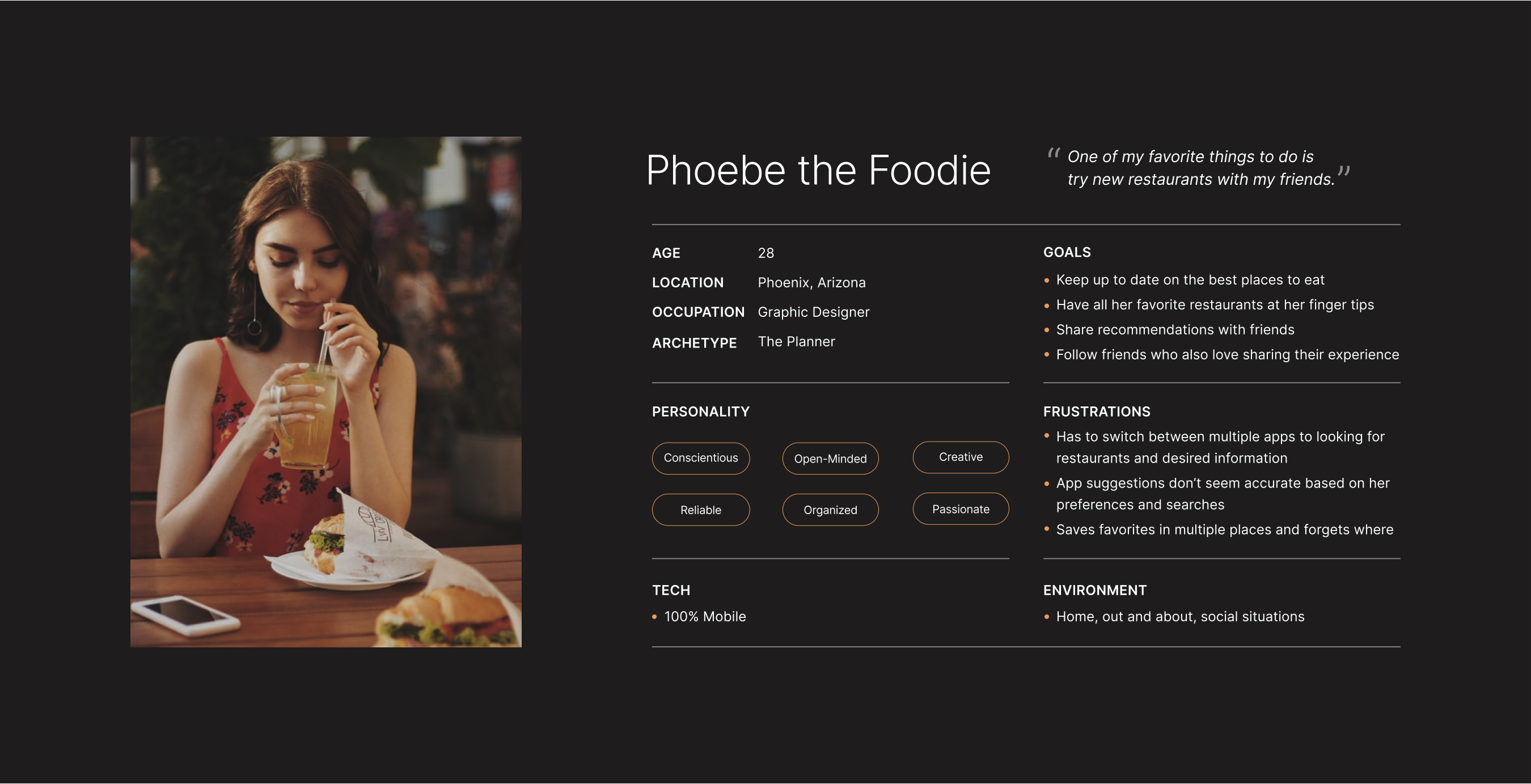
Persona
A persona was built based on the data collected to help drive decision making and keep the product focused on solving users pain points, frustrations, and goals.
Ideate
Cooking up a better experience
To kick-off the design process, quick sketches helped me get ideas on paper to establish which elements were necessary for each screen. A low fidelity prototype was then created for initial user testing.
User Flow
The primary user flow is the process of searching, saving and sharing with friends.

Site Map
YUM's simple information structure makes it easy to navigate and move through tasks.

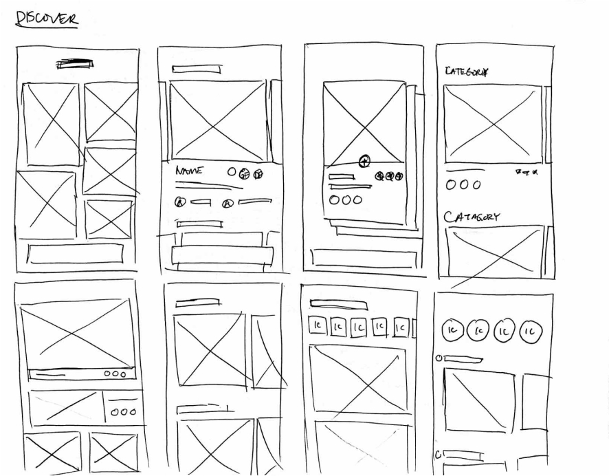
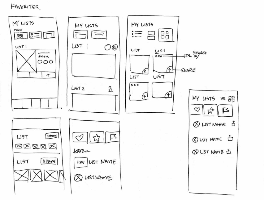
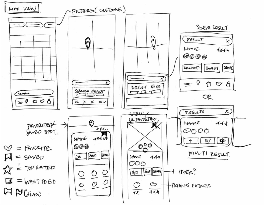
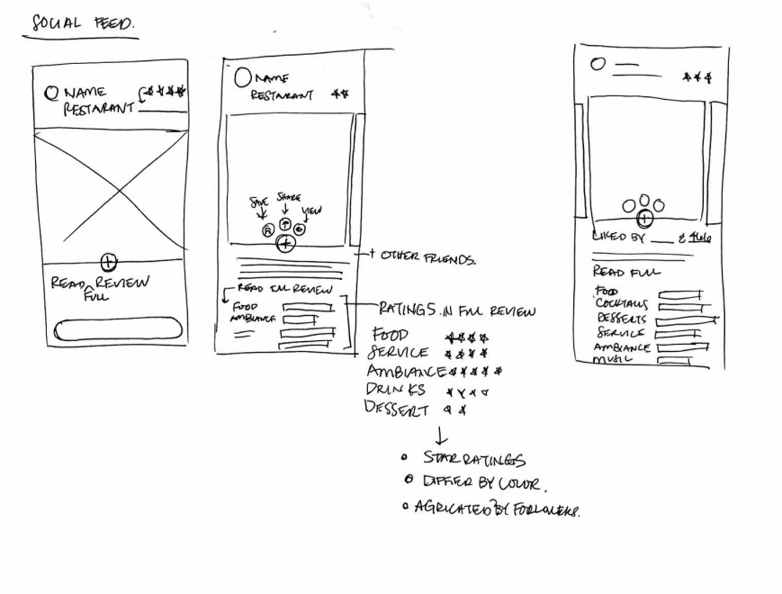
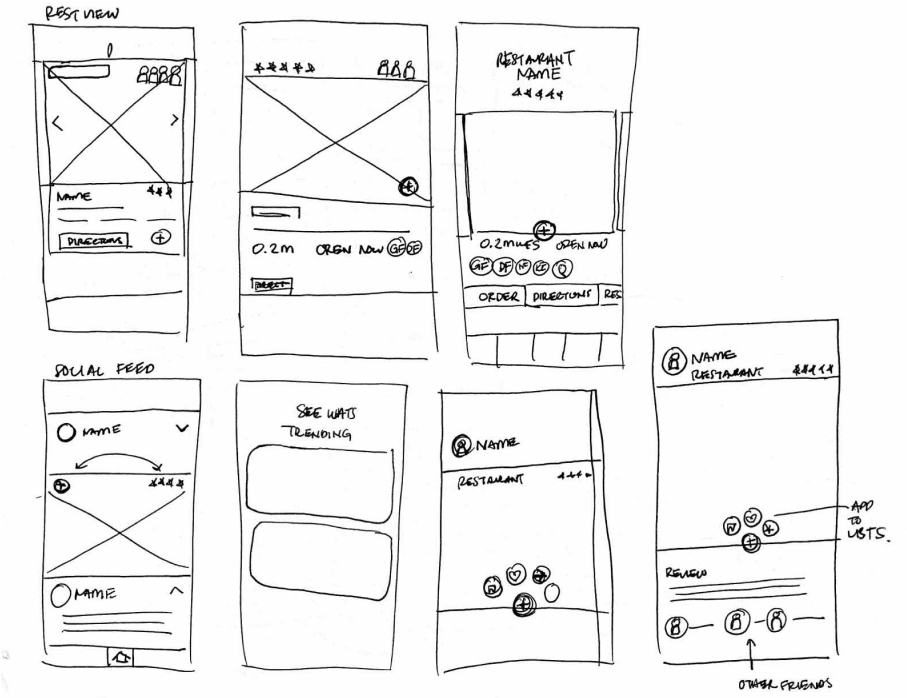
Sketches
Rough sketches were done to get my initial thoughts on paper and brainstorm new ideas for specific UI elements.
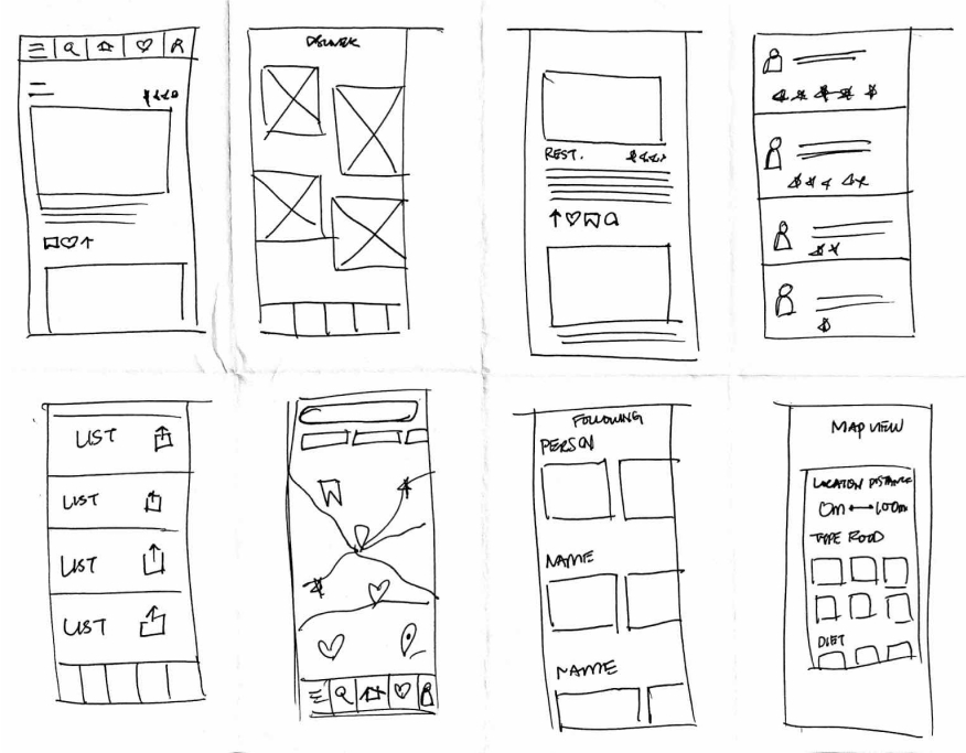
Low-Fidelity Prototypes
Using the feedback and insights gained from research, analysis and sketching, a how-fidelity prototype was created to begin user testing.
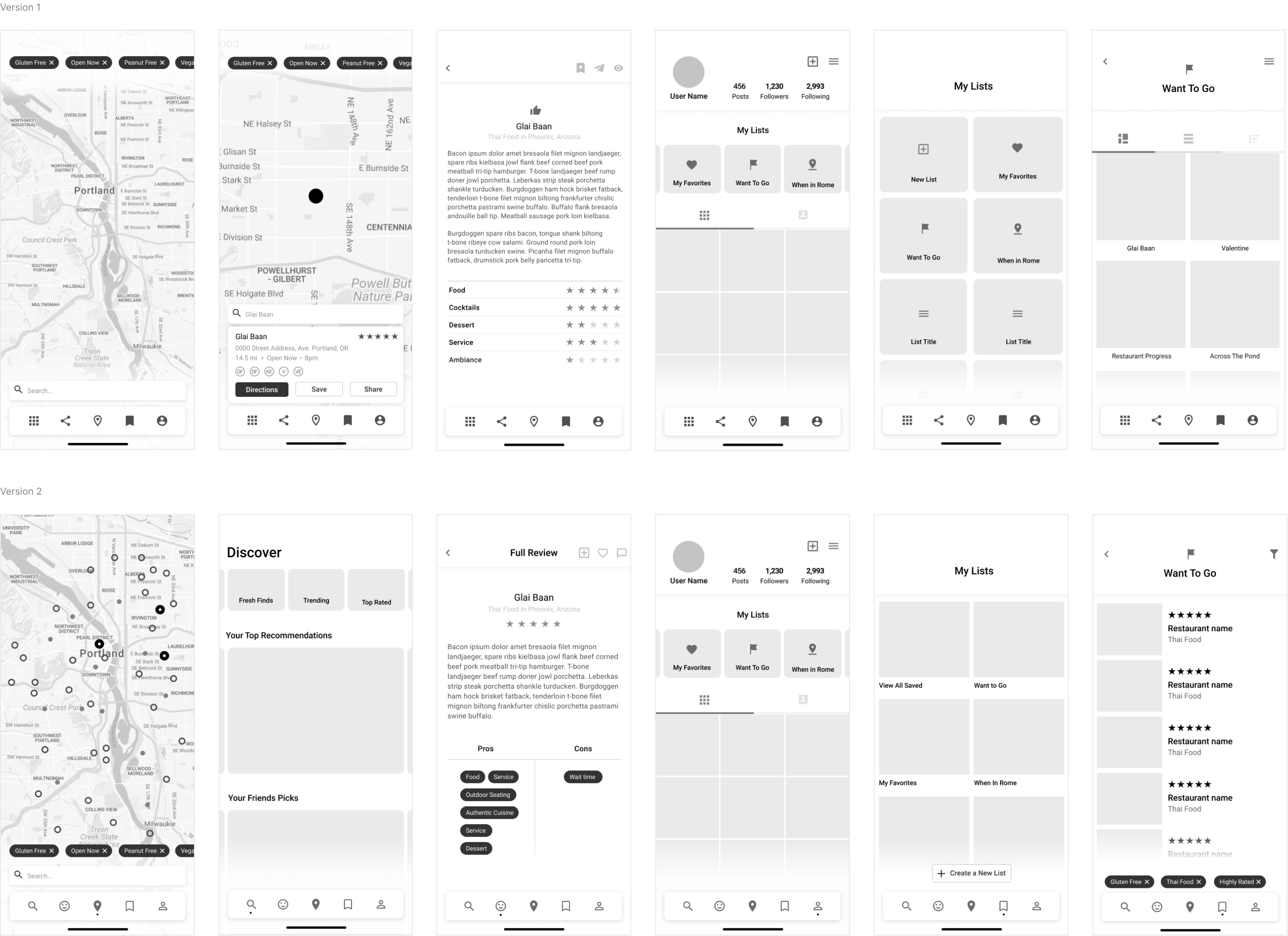
Usability Study
A usability study was conducted to determine where improvements could be made and identify new ideas to satisfy user expectations, needs, and desires.
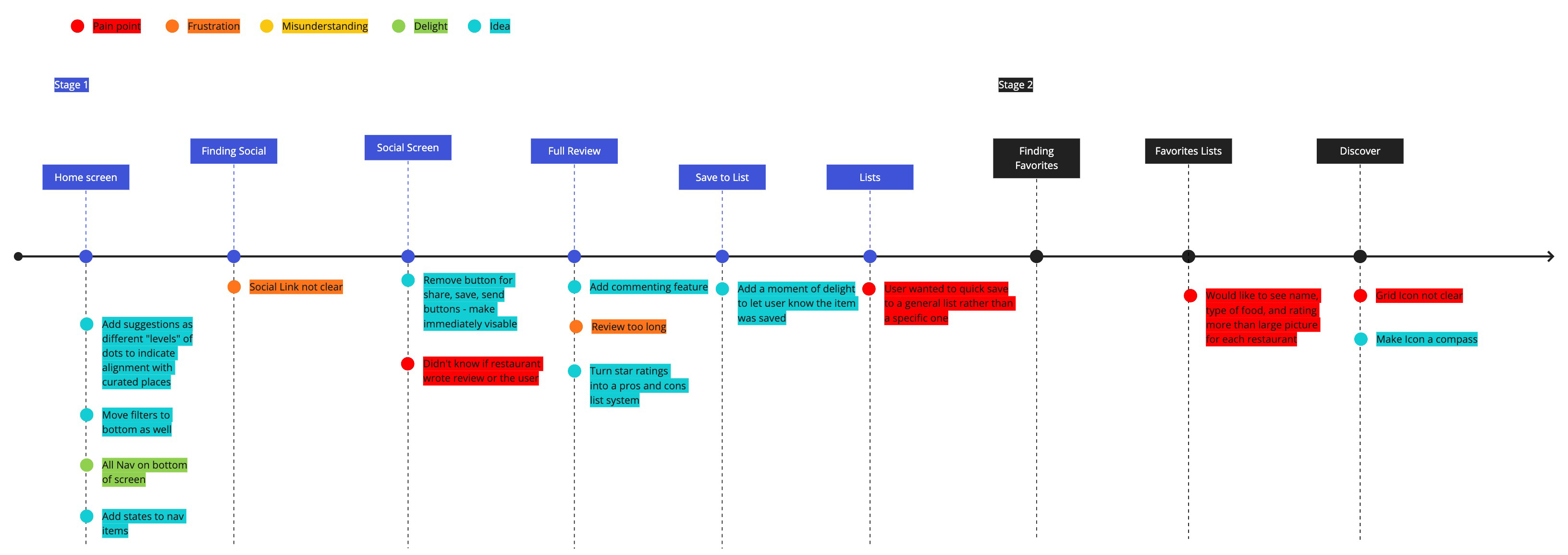
Pain Points
01
Source of restaurant review was unclear
02
Quick save option not available, had to specify which list to save to
03
Emphasis on photos made it difficult to find type of food and restaurant ratings
New Ideas
01
Use color to differentiate YUM's suggestions from a users saved restaurants
02
Remove multi-step process to find social icons and make immediately visible
03
Add a moment of delight to let the user know a restaurant was saved

